Human-computer interaction
Attention
4 main types.
- Selective: Tuning out other things to a select set of stimuli
- Sustained attention: Focusing on a single task for a long time
- Divided attention: Focusing on multiple tasks at once
- Executive attention: More organised sustained attention - having a plan/end goal in mind and tracking progress over a long term task
Focus determines how a system is interacted with, so grabbing attention in the right ways makes for effective interfaces.
How to keep attention:
- Don’t clog the UI
- Switch visuals often to keep it fresh
- Make tasks intuitive, so less focus effort is needed to complete a task
- Don’t overdo attention grabbing techniques, it can be annoying
Memory
Short term memory
- Can hold ~4 things at a time
- Used as a scratchpad for holding transitory information
Long term memory
- Episodic: Events and experiences in sequential, serial form. How we remember / reconstruct past events.
- Semantic: Collection of facts, concepts and skills, which are derived form episodic memory.
Commiting to long term memory
- We need to make committing interface actions to long-term memory as effortless as possible.
- Common design patterns can help: eg. people already know that blue text = hyperlink, exploit that pattern
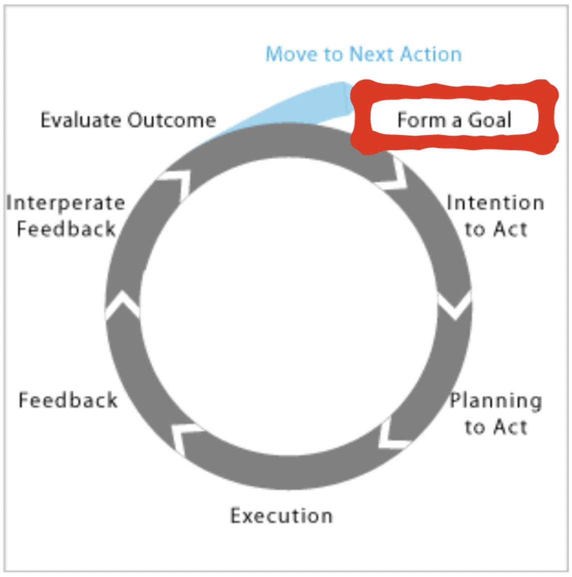
Norman’s human action cycle

Norman's human interaction cycle
- Gulf of evaluation: Psychological gap of interpreting a UI, and the expected result of performing an action.
- Gulf of execution: Gap between the user’s goals and the means to execute them, ie. number of steps required to do something.
We can extract some design principles to optimise these aspects of a design.
- Visibility: Users can tell the system’s current state and their possible options
- Good conceptual model: Action outcomes are consistent in their presentation
- Good mappings: Easy to determine an action’s outcome from it’s appearance and context
- Provide feedback: Users get constant and consistent feedback on the effect of their actions
Gestalt laws of perceptual organisation
- Figure-ground principle: People segment vision into a “figure” (foreground) and “ground” (background)
- Similarity principle: form informs function (eg. blue hyperlinks)
- Proximity: Elements close to eachother have similar function
- Common region: Elements grouped together (eg. in boxes) have similar function
- Continuity: Objects on a line/curve ae continuous and similar
- Closure: Complex arranements are seen as a single pattern (eg. tiger image made of black stripes)
- Focal point principle: Attention is drawn to a standout element
Affordances and signifiers
- Affordances: Functions an object allows us to do
- Signifiers: Cues/hints as to an object’s affordances
For example, a road has the affordance of being able to walk on it, but crossings act as a signifier as to where you should cross.
A save icon is a common signifier, informing a user of the save button’s affordances.
Usability
Concepts that impact system design:
- Feedback: Informing users of the effects of their actions
- Constraint: eg. blurring non-focused activities
- Mapping: Relate controls to their effects eg. dragging objects into a recycle bin
- Consistency: Similar operations for similar elements for similar tasks
Nielsen’s usability principles:
- Visibility of system status
- Match system and real world: ie. use familiar language to user
- User control and freedom: Give escape routes such as an undo button
- Consistency and standards (especially consistency in the use of language)
- Help user recognise and recover from error
- Error prevention: eg. “Are you sure?” dialogue
- Recognition, not recall of action flows
- Flexibility and efficiency of use: eg. macros for advanced users
- Aesthetic and minimalist design
- Provide help and documentation